You, Your Book Cover, Your Reader: A Story in Seven Seconds
Here’s What You Need to Know about the Cover Design for Your Book
Like it or not, we do judge books by their covers.
You have seven seconds, maybe less, for your book to make its case.
With book reviewers who can sway readers to order it now. With journalists who will be (in your wildest fantasies) endlessly curious about your ideas and the story behind them. With schedulers on podcasts and television shows who will book you now.
Seven seconds, that’s about it. Readers may give you ten. But gatekeepers will give you seven if you’re lucky.
I speak as the longtime editor of a women’s magazine called Sage. I describe it as a life-giving magazine and a forum for conversation—and that tells you a bit about what I was looking for. I had an inner sensibility about what could get in—and what I could leave behind.
So that’s why the cover design matters. It’s your first conversation.
You need to talk fast, and visual communication talks faster than text communication.
As a book coach who works with many first-time authors, I want to encourage you that the cover design process does not have to be daunting. It can be a collaborative and elevating effort that gets you into the right conversation.
Here is what you need to know.
Oh, and by the way, the person credited with coining the phrase, “Don’t judge a book by its cover,” is English novelist George Eliot (Middlemarch), who may have known a thing or two about covers—her true name is Mary Ann Evans, and she chose a man’s name as her pen name, or “cover,” because she wanted her books to be taken seriously.
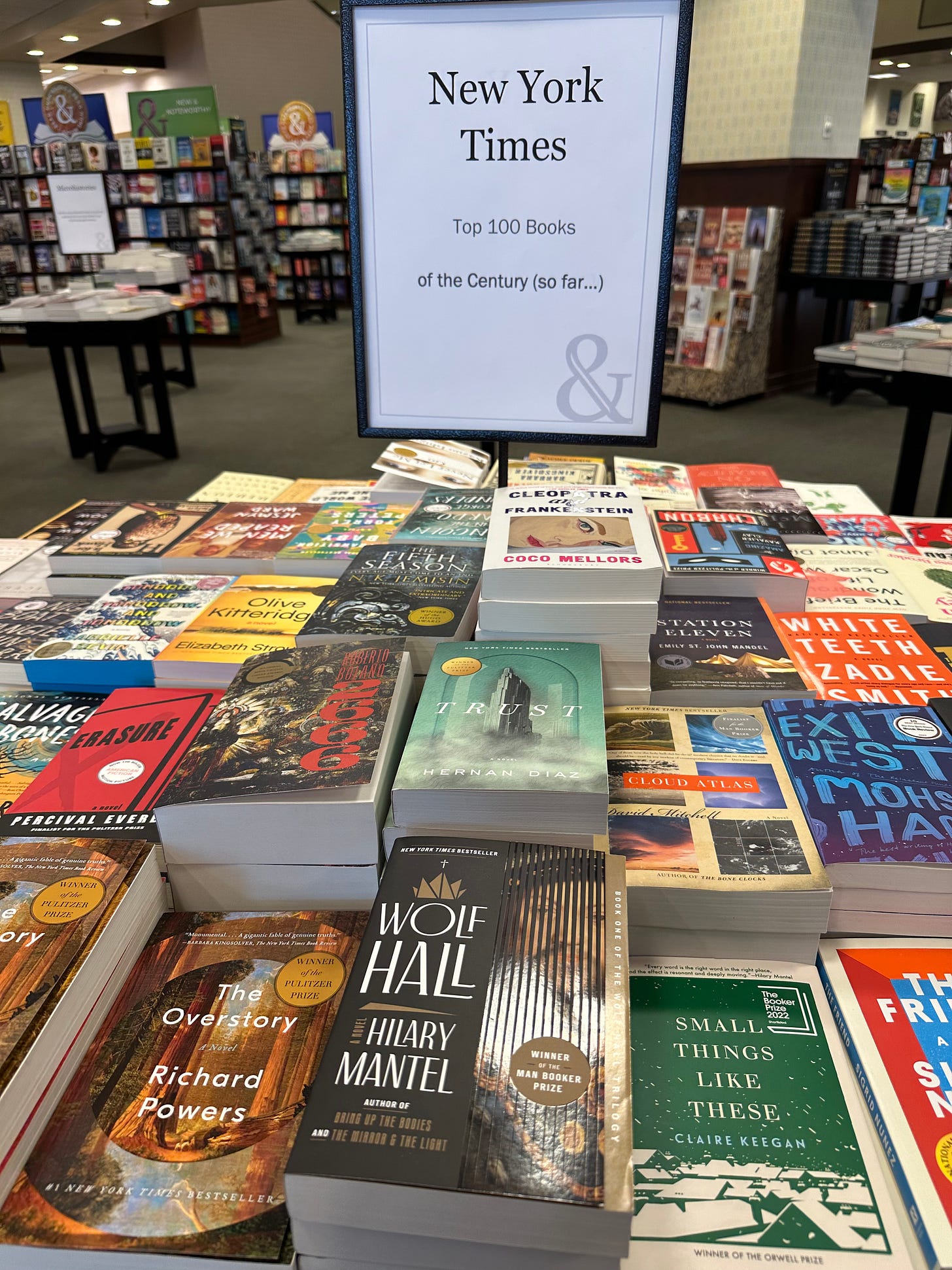
At Bookworks in Albuquerque, New Mexico, on the front table: Some of The New York Times’ top 100 books (so far!) of the 21st century. (My personal favorite, front near center, The Overstory by Richard Powers.
What is yours to do
> Your intuition is spot-on. What you know about your book is deep in your soul. Your designer wants to know what your intuition is telling you because that is potent. Not only that, your inner knowing is the root of originality. It’s the place where your book stands out from every other book. Don’t hide it. Go there.
I knew the cover of my empty-nest memoir, Boundless (coming Fall 2024 from Atmosphere Press), had to have a horizon. When I had the first meeting with the designer, I didn’t talk colors or fonts, I talked metaphors. I talked about what was singular about my book.
Read more about the behind-the-scenes of this cover here.
Boundless is available for pre-order!
My memoir about how we are always becoming someone new is arriving with perfect timing -- on a day of rebirth, Winter Solstice, which happens to be my birthday. Mark the date -- 12.21.2024! Read about it here. Get on the pre-order list here.
Order it here!
BOOKSHOP - proceeds go to Bookworks, an independent bookstore in Albuquerque
Come on over to carolynflynn.com and sign up for the mailing list to get news about Living Boundlessly, Story Catalyst writing craft classes and Uncommon Hours productivity for creatives. Get a free downloadable book club discussion guide for Boundless at carolynflynn.com.
> It’s all about the hook. If you’ve gotten this far, then you know what your hook is. This can be a good time to revisit your hook statement, your elevator pitch and the query letter that got you the book deal in the first place.
All the elements that go into choosing the title and hook statement are about to get translated into visual language. Ground yourself in the truest essence of your book, then take yourself to the shelves.
[What’s my hook? If this question troubles you, take a crack at writing your encapsulated hook statement with this downloadable worksheet. If you’d like to bat around your title, subtitle and hook, schedule a 1:1 with me here.]
> Do your field study. What works? Go to your local independent bookstore and look at the book cover designs that make the front table. This table is filled with books that are poised to succeed. Other smart people have decided that if they put them there, you will want to read them.
Be curious. This is your habitat. What works? What doesn’t? What appeals to you? What surprises you?
The book table display of The New York Times top 100 books (so far!) of the 21st century, Page One Books, Albuquerque, New Mexico.
How to work well and play well with others
> Establish early how your publisher sees the collaboration. And be sure to state how you see it.
Ask how many rounds of design are typical. Ask what kinds of changes you can request, and when in the process you can.
> You can push back. You may not know design, marketing and publishing as well as they do. What you do know is your book. Here is where your intuition, your hook statement and your field study can guide you.
> But choose your battles. What can you live with? What can you not live with?
The magic secret strategy that no one else tells you
If you are with a Big 5 publisher, you’re probably not going to have much say. (I had absolute zero say in my first seven books, published with Penguin.)
So the question you’re left with is: What are the best ways to influence the process?
Long before your book reaches publication, build your platform. You’ll want to do this anyway so you can get an agent and a publisher.
As you are building your platform, you are in the early stages of building a brand and an audience. If what you do works, then that speaks.
The tone of your writing, and your audience’s response will speak to what works. The visuals that establish your core identity are already associated with the subject matter, and the audience is familiar. The choices you make about logos, images and typography of your digital presence are a good starting place for the discussion.
If you are with a small or independent publisher, you may have more back-and-forth about the cover design. But still, establish your brand and your audience. You’re going to be happier.
The care and feeding of designers
> Get familiar with the language of design, and let your designer teach you. Ask your designer early and often to explain terminology. Ask your designer to analyze designs you like and tell you the technical details that make them work. Ask your designer what covers they like best among previous work and explain why they work.
> Ask your designer what approach she/he/they will take. Is it type-forward? Color-forward? Illustration forward? Is the illustration abstract or does it have a narrative? What tools will they rely upon?
> Ask your designer about the approach to the composition -- you can see here that with the cover of Timothy Egan’s Immortal Irishman, that it takes a newspaper approach. This seems like it will be about history. The type looks like a newspaper font, and the photo is historic.
The Immortal Irishman, Timothy Egan
You can see here with Elizabeth Gilbert’s cover for Big Magic that she’s taking an abstract, color-forward approach that’s much in line with the self-help/spiritual/creativity nonfiction market.
Big Magic, Elizabeth Gilbert
And with Leslie Jamison’s cover for her latest memoir, Splinters, you can see it has a disturbing or subversive cover. She is a memoirist known for upending the way we see life.
Splinters, Leslie Jamison
> Let your designer transcend your limitations. OK, I may have buried the lead here, as they say in the journalism business. This could be the best advice yet. Assure yourself you have a brilliant designer—one who will listen to you but also be able to transcend your limitations. The best book covers, CD/album covers, wine labels and political posters come from a place that the artist-creator could not even imagined.
Shepard Fairey designed this stylized stencil image for the 2008 presidential campaign of Barack Obama. It first appeared as a street poster. Now it’s in the Smithsonian.
Pink Floyd said, “We don’t need a psychedelic space rock cover. We will not be limited by that. We want this as plain as possible.” This was the result for “Atom Heart Mother.” It is said to be inspired by Andy Warhol’s famous cow wallpaper.
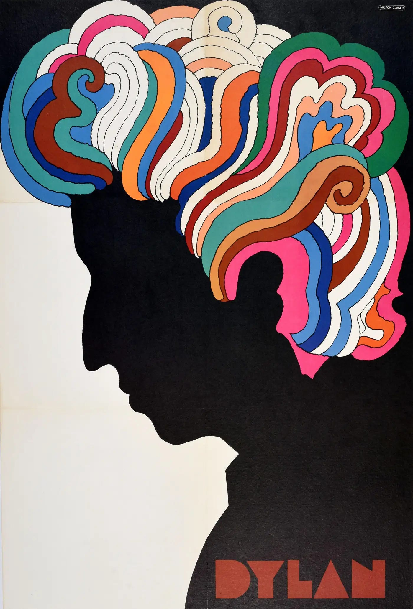
Bob Dylan need not approve. Milton Glaser took this to the level of iconic.
You want your designer to go out of the box, like Louise Fili always does with typography!
Could any one author/one rock band/one politician ever on this planet have come up with something as brilliant as these?
How do you set your designer free? How do you signal that you’re OK with your designer pushing higher? Get out of the box yourself. Find out-of-the-box stuff that you think works, and ask your designer why. Look at other genres, like album covers and political posters. Back to that book table at Barnes & Noble or your local independent bookstore. What absolutely grabbed you? Have that conversation.
A few more gut-checks for you: Get to what’s really real
> Be clear on your intended audience. You may like the design of Author A because of the colors or because you aspire to write like that author. But Author A is not writing to your intended audience -- you just like him.
Colum McCann’s Let the Great World Spin
Love me some Colum McCann, but is his book cover my book cover? No.
Here’s another wrinkle: The cover design may not work for your lover or your best friend or your sister. So what?
Are they in your intended audience? Did you write the book for them? (Have they even read it?)
Do they love you perfectly well? Yes. So move on.
The only thing that matters is whether it reaches your intended audience.
> You are not writing a book for your inner circle.
You’re writing a book for readers who want to read what you write.
You haven’t met them yet. If you already knew them, you would just drop off pages on their doorstep. Maybe they live in your same town or even your same house.
But somewhere early in the process, you decided you would write a book so you could reach people who were everywhere else.
You decided you wanted a publisher so you could get the book to that audience.
Your intended audience wants what you have. Your inner circle just wants to see you be happy.
> You are not writing a book that will appease all present and future critics.
The first question to ask about your critics: Are they in your intended audience?
If yes, then pay attention. Take time to listen to what they are saying. What were they expecting? What are they judging harshly? What do they need? What do they truly want?
And remember, some of the things they judge most harshly can be something you intended. Perhaps you want to provoke thought. Perhaps you want to create a little inner disturbance. That’s how we change. Perhaps you want your book that brings people to hard questions for themselves. Perhaps you wanted to be subversive.
If that’s what you want, then make sure you are disturbing the right people: your intended audience.
If they are not in your intended audience, this book is not for them. Don’t even bother thinking why they are spending so much time and energy criticizing something that isn’t for them.
> Remember, the design can change with every edition -- from hardback to paperback, from U.S. rights to foreign rights (possibly a different cover for every country) and so on. Sometimes, you get a second chance!
Top: The U.S. design for David Whyte’s essay collection, Consolations. Bottom: The U.K. design.
> And finally, stand confident in the knowledge that your book is worthy and it will find its readers. If you have written it, it will touch someone. It will find its audience no matter the cover design.
You need to just keep believing. Keep bringing the conversation up. Keep shedding light on how you see things. It will leap out of the pages of the book and into people's hearts. Keep doing what you do. Be brave, be light, be you!


